About Ravenedge
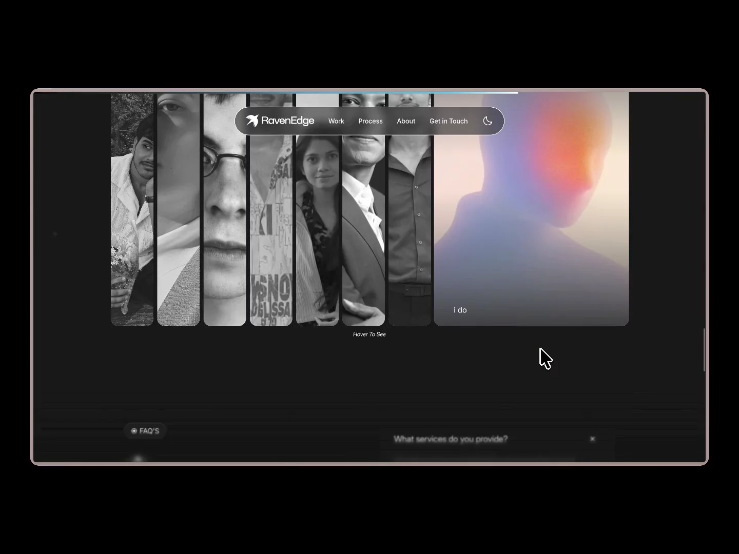
I built ravenedge.in entirely from scratch for my agency, RavenEdge. No templates, no marketplace kits. Every component on the site, the hero, the project showcase, the team section, the FAQ, is custom-coded specifically for this build.
The site runs on microinteractions rather than static sections. Hover states, scroll-triggered reveals, and click feedback are built into nearly every component, so the page reacts as you move through it instead of just sitting there. Nothing is decorative for the sake of it, each interaction is tied to a specific moment: a hover that previews a project, a scroll that stages the process steps, a click that expands an answer.
Light and dark mode are both fully designed, not a single palette with inverted values slapped on top. Typography weight, image treatment, spacing, and contrast were tuned separately for each mode so both feel intentional rather than like an afterthought toggle.
Structurally, the site covers what a client actually needs to decide fast: recent work up front, a breakdown of what we build, a plain four-step process from discovery to delivery, the team behind the work, and an FAQ that answers pricing, ownership, and revisions before a call is even booked.
Built solo, from the Framer canvas up. Every animation, layout, and mode was designed and coded by hand rather than assembled from existing pieces.
Happy to break down any specific component or interaction if it's useful.