Neo Press Button
The Framer button people can't stop pressing.
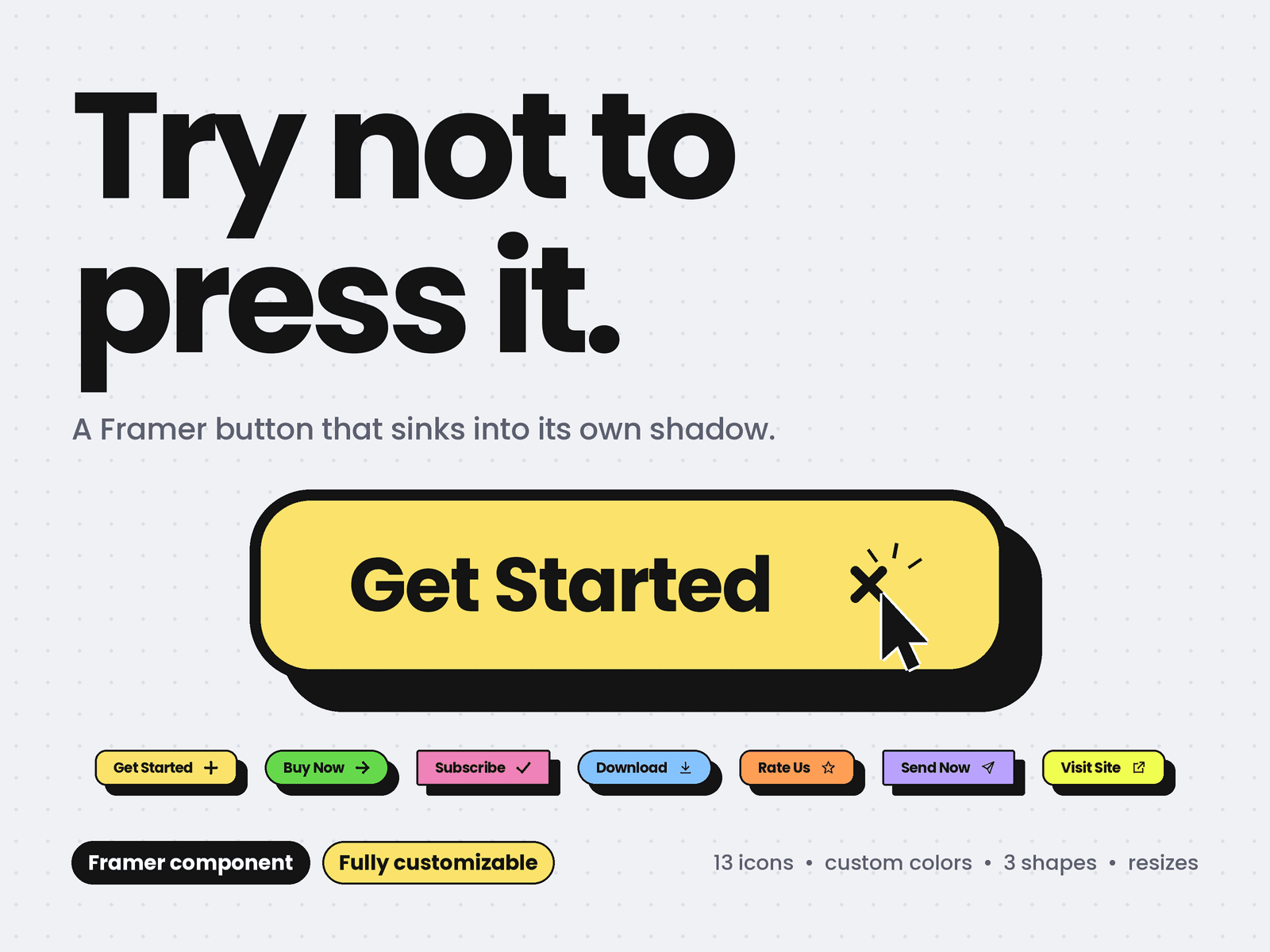
A chunky, tactile button that sinks into its own hard shadow. Hover and it dips, press and it lands flat, release and a spring pops it back. It feels like a real key, and visitors click it just to feel it again.
Why you'll love it
Three states, spring motion: rest, hover and pressed, each with natural spring physics
Icons that react: the plus spins into a cross, the star twirls, the heart pulses, the download drops, the send flies off
Soft light sweep across the face on hover
Haptic buzz on supported phones
Drop in and go: paste it, set the label, link it, done
Customize everything
Color: Yellow, Green, Pink, Blue, Orange, Lilac, or Custom with your own fill, text and border + shadow colors
Shape: Rounded, Pill or Sharp
Resize to scale: drag the component bigger or smaller and the text, icon, padding and shadow scale together
13 icons: Plus, Arrow, Check, Star, Heart, Download, Send, Cart, Play, Mail, Sparkle, External link or None
Label, link and new-tab toggle, plus a click event for your interactions
Any font and weight
Border width and shadow depth
Hover sink: choose how far it dips before you press
Spring controls: stiffness, damping and mass, from snappy to bouncy
Shine and haptic switches
Built the Framer way
Fits its label automatically, or fills any width you set
Static render and export safe: nothing animates there
Respects reduced-motion settings
Clear keyboard focus ring
Works as a real link or button
Perfect for
Hero calls to action, pricing cards, sign-up forms, portfolios, landing pages and neo-brutalist designs.
Set up in 30 seconds
Paste the component into Assets > Code
Drag it onto your page
Pick a color, shape and size in the properties panel
Add your link and hit Preview to feel the press
Add it once, restyle it anywhere.