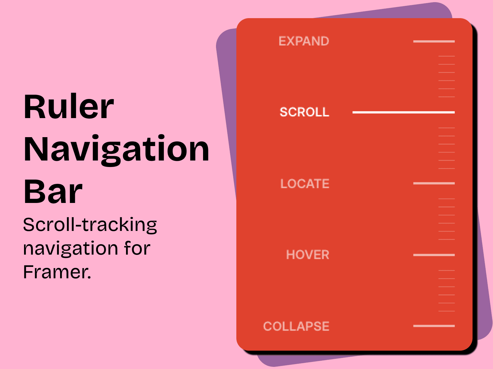
I wanted a navigation bar that didn't look like a navigation bar.
I was working on a client site and needed something to help visitors move between sections, without a big menu sitting on top of everything. So I started playing with the idea of a ruler on the side of the page. One tick per section, and as you scroll, the active tick stretches out and shows you where you are.
That became RulerNav.
What I like is that the component itself is simple, but it can feel completely different depending on the site. The Marketplace version is bold and playful. The one I'm using on the client site is quieter: no background, thin lines, barely there until you scroll. I'll share the finished version of my client's website soon. Until then, enjoy. ❤️