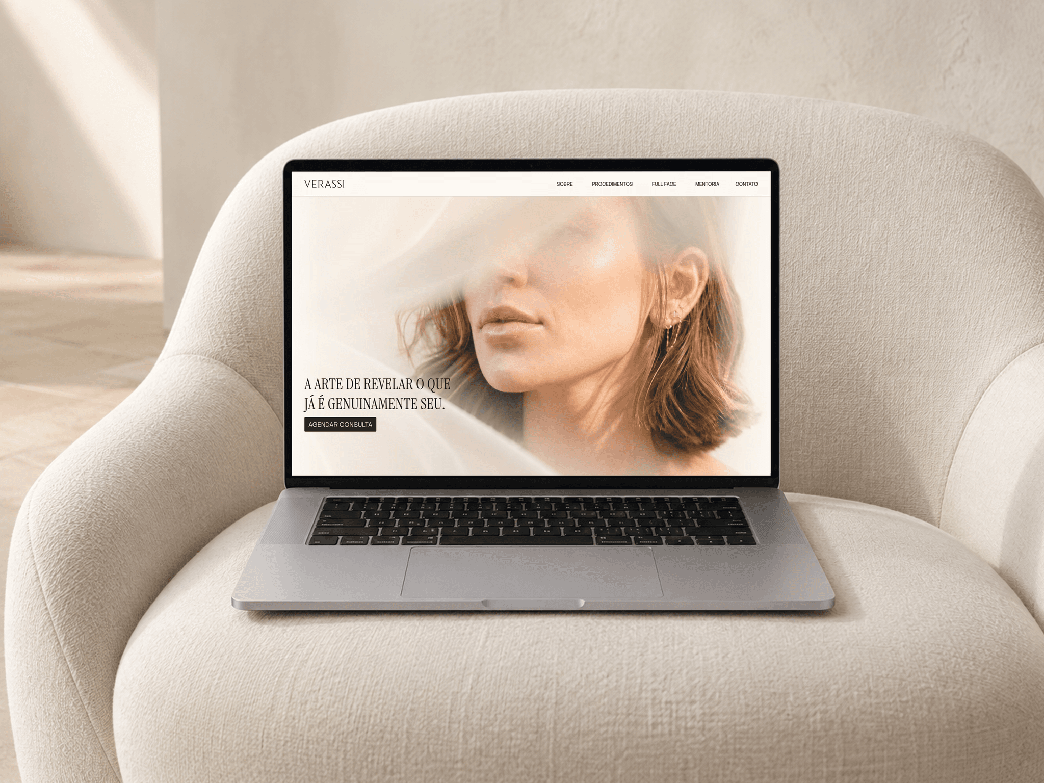
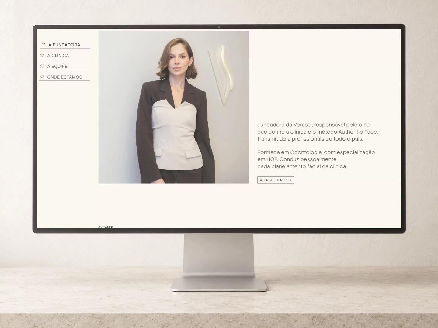
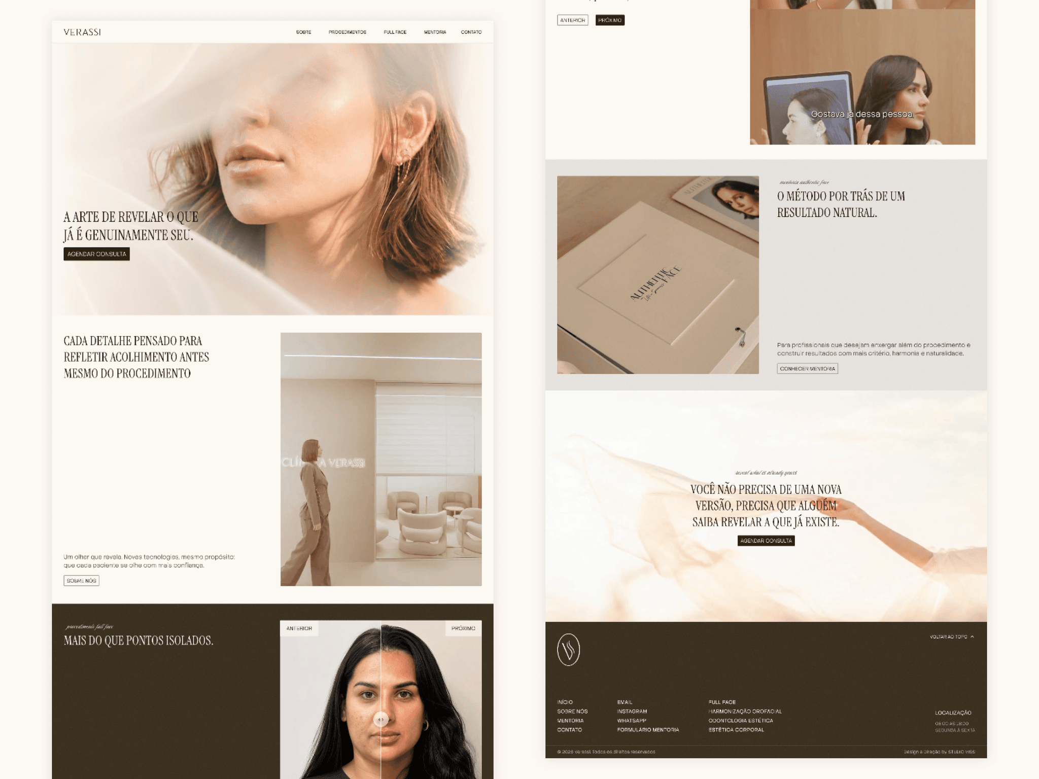
Just published Clínica Verassi, an aesthetics clinic in Brazil.
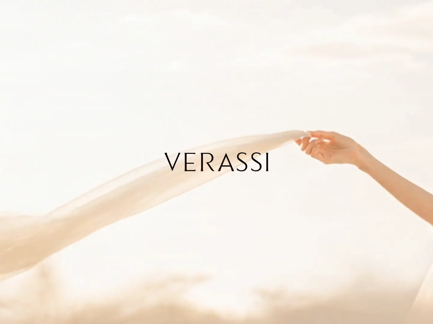
The brand line is "the art of revealing what is already genuinely yours." So we built the site so that nothing arrives. Everything is uncovered.
Text rises line by line out of a mask. A word lights up as you read past it. A button draws its own outline before you press it. The before-and-after cases are not a crossfade, they are a divider you pull across the face yourself.
Studio Viss did the brand direction, the identity and the site. Every section runs on a code component written for that section, which is also what keeps it light: hover is CSS with no listeners, timers only run while their section is on screen, one image loads eager and twelve lazy.
The decision I would argue for: settle the motion vocabulary from the brand idea before opening the canvas. Every later choice answered itself.