About Dark Mode Toggle
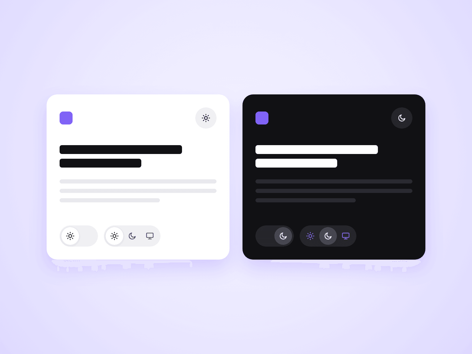
A toggle that lets visitors choose Light, Dark or System. The whole site switches, and the choice is saved for their next visit. One component gives you three types: a switch, an icon button and a segmented control.
What you can customize
Everything is set from the property panel. No code needed.
- Type: Switch, Button or Segmented
- Default theme for first-time visitors: System, Light or Dark
- Remember the choice, or not
- System option shown or hidden
- Height, icon size, radius and inset
- Text next to the icons, with your own labels and font
- Separate toggle colors for light and for dark
- Transition of the moving thumb
Details
- It switches between the Light and Dark values of your Framer color styles. Your site needs color styles with a Dark value.
- One toggle changes every page of the site.
- Several toggles, for example in the navigation bar and the footer, always show the same state. Other open tabs follow too.
- System follows the visitor's device and changes with it.
- Scrollbars and form fields follow the chosen theme.
- Works with keyboard and screen readers.
- A page first appears in the device's theme. A saved choice is applied when the page has loaded, so a visitor whose saved theme differs from their device can see a short flash.
- Colors typed in directly and images do not change.
How to use
Add the component to your navigation bar and choose a Type. If your page already turns dark when your computer is in dark mode, the toggle works at once. If not, give your color styles a Dark value first. On the canvas the toggle cannot be clicked. Open the preview to try it.
Code
This is a code component. Unlinking is not available, so the source cannot be viewed or edited. Updates arrive through the Update button in your Assets panel.
Support
Email joviseo1106@gmail.com. Replies usually take up to 3 business days. More components are at https://joviseo.vercel.app