About Dotted Arrow Button
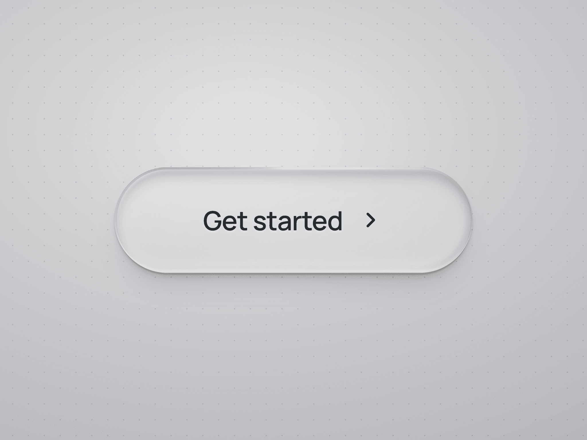
Dotted Arrow Button is an animated Framer component for landing pages, portfolios, pricing sections, and other CTA areas.
Its hover interaction combines staggered letter transitions with swapping arrow circles. The individual arrow dots also pulse in a repeating animation with a three-second pause between cycles.
What Is Included
Default, Hover, and Pressed states
Editable native Framer layers
Eight arrow directions
Separate Start and Hover arrow directions
Animated text transitions
Individual dot-pulse animations
How to Use
Add the button from Assets to your Framer page.
Set the Label and Uppercase options.
Open the main component and select Animated Text to change the font.
Adjust Background and Text Color.
Use Start Background and Start Arrow Color for the initial icon.
Use Hover Background and Hover Arrow Color for the ending icon.
Choose Start Direction and Hover Direction.
Add a Link, enable New Tab, or connect On Click to a Framer action.
Preview the button to test hover, press, text, and dot animations.
Customization
The button uses content-based sizing, so check longer labels in narrow layouts.
You can edit the native layers to change spacing, proportions, and shape. Keep the Animated Text component and dot-animation overrides when copying or modifying the button.
Animation timings are controlled in code and are not exposed as instance controls. Reduced-motion and static-renderer fallbacks are included.
The liquid gradient background and tilted cover styling are presentation artwork only and are not part of the component.
Ideal For
Hero CTAs, portfolio links, project buttons, pricing pages, signup buttons, agency websites, and service enquiry links.