About Feature Tabs
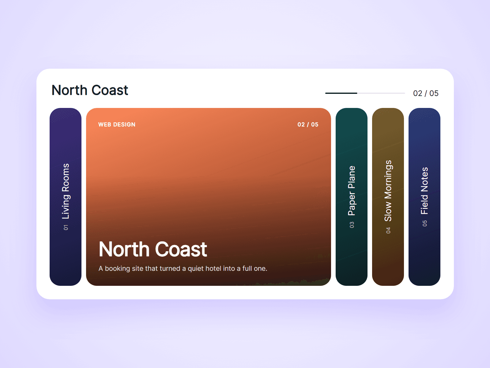
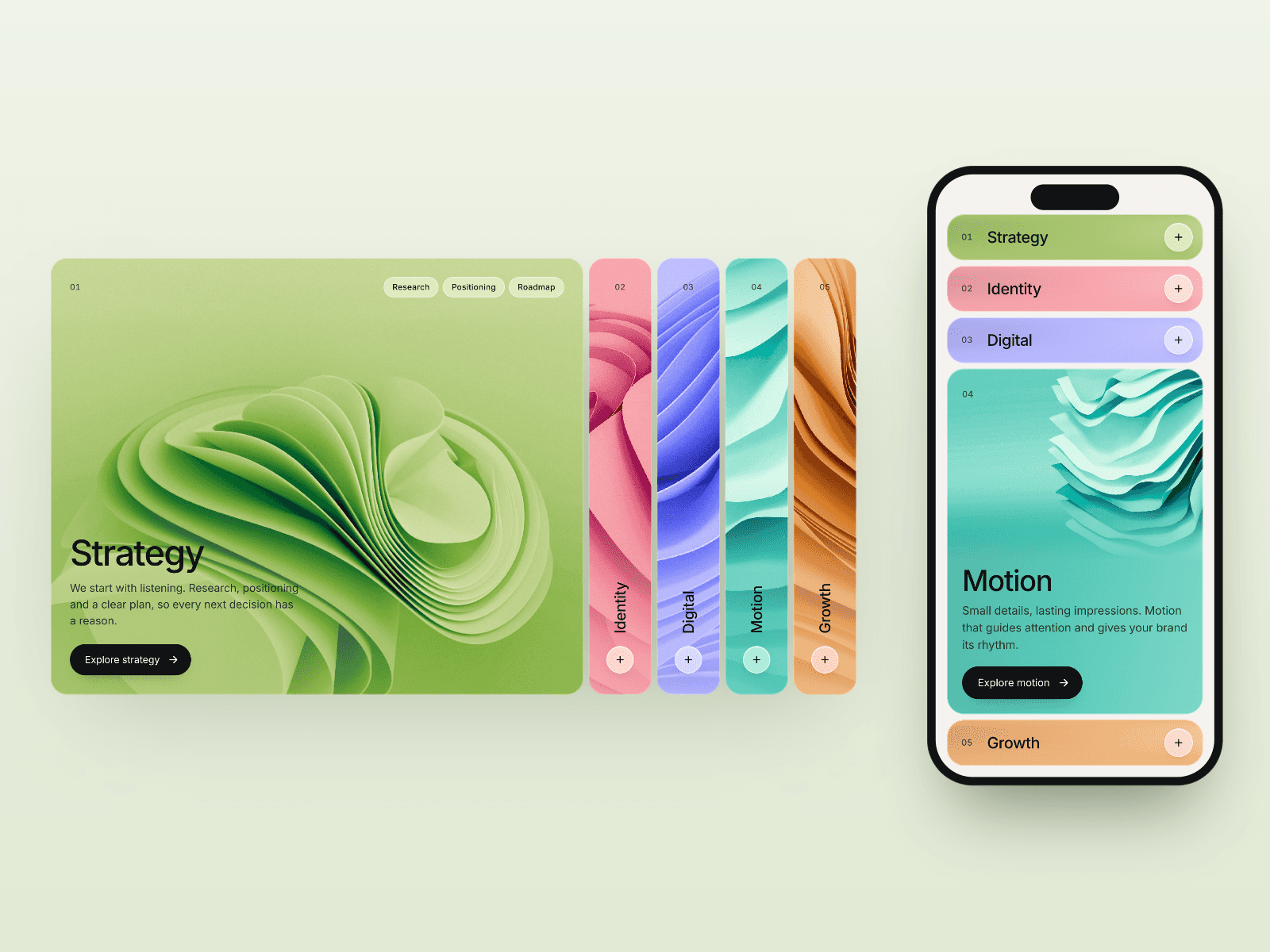
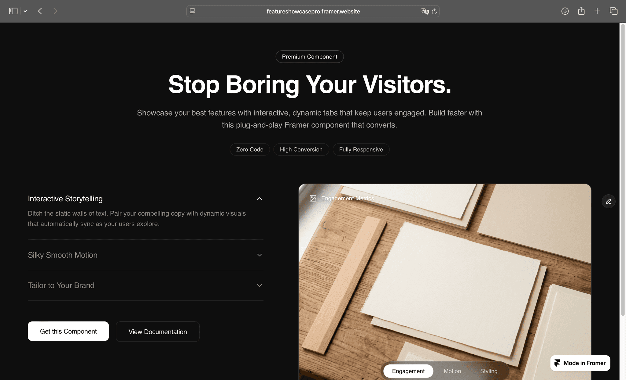
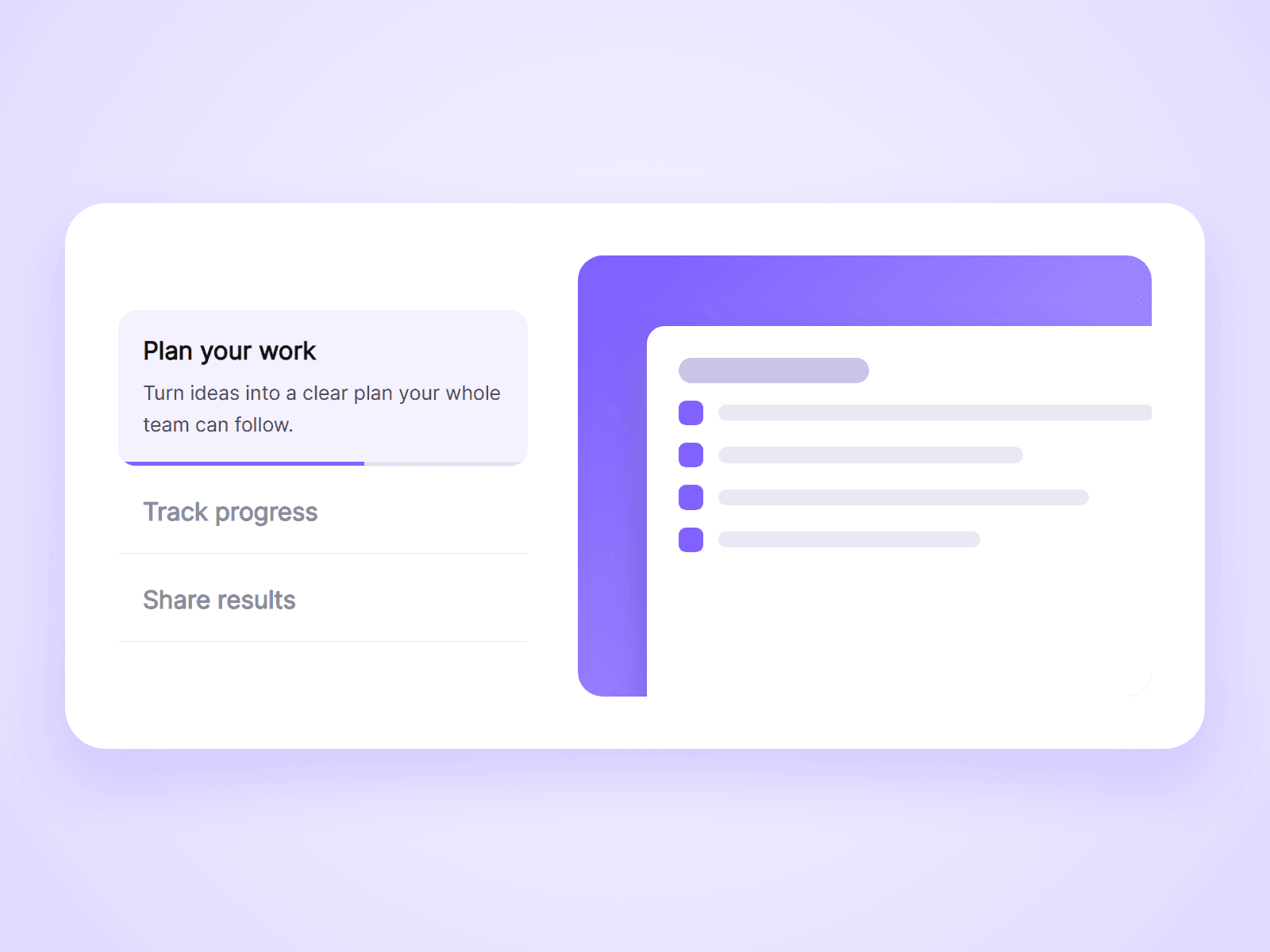
A feature list beside a media box. One feature is open at a time with its description and image, a progress bar fills under it, and the next feature opens by itself. Visitors can click any feature to jump to it.
What you can customize
Everything is set from the property panel. No code needed.
- Up to 8 features, each with a title, text and image
- Media box on the right, left or top
- Switch on click or on hover
- Autoplay, interval, and pause on hover
- Progress bar color, track and height, or hidden
- Numbers before the titles
- Media box ratio, image fit, radius and fill
- Gap, padding, radius, active fill and divider color
- Fonts and colors for titles and text
Details
- Images use Framer's own image picker, so they are optimized like the rest of your site. No image URLs to paste.
- Autoplay runs only while the component is on screen, so visitors always start at the first feature.
- A click on a feature restarts its progress bar.
- On narrow screens the media box moves above the list by itself.
- Works with keyboard and screen readers. Visitors with reduced motion turned on do not get autoplay.
- A feature without an image shows a colored placeholder, so you can build the section first.
How to use
Add the component to your page and set its width. Open Features in the property panel, type your titles and texts, and choose an image for each. On the canvas the first feature is open and the progress bar is partly filled so you can style it. Open the preview to see it run.
Code
This is a code component. Unlinking is not available, so the source cannot be viewed or edited. Updates arrive through the Update button in your Assets panel.
Support
Email joviseo1106@gmail.com. Replies usually take up to 3 business days. More components, including four free ones, are at https://joviseo.vercel.app