About Stacked Media Cards
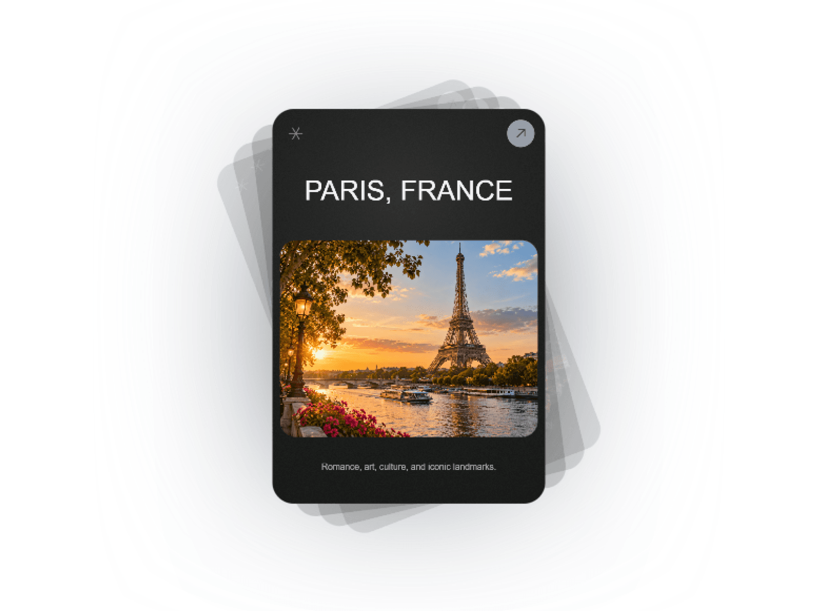
Showcase images and videos with an interactive 3D stacked deck, smooth swipe physics, customizable ambient glow, and auto-cycling.
Features
Interactive 3D stacked media card deck
Hardware-accelerated WebGL shader rendering
Smooth touch swipe, cursor drag, and trackpad wheel support
Ambient background halo and soft drop shadows
Support for responsive images and looping background videos
Dynamic card fanning with customizable fan angles
Kinetic drop-and-exit card transitions
Autoplay cycling with hover-pause functionality
Accessible keyboard navigation with live screen-reader status
Built-in client-side media uploader for live visitor previews
Auto-pausing animation loop when offscreen for zero idle GPU load
Customization Options
Card width, height, and responsive stage scale
Card corner radius and inner media radius
Fan rotation angle, drop distance, and vertical offset
Card background color, typography colors, and font sizes
Glow halo intensity and dynamic per-card tinting
Shadow depth and blur spread
Auto-cycle intervals and transition duration
3D cursor tilt responsiveness
Gesture controls (drag, swipe, wheel scroll)
Texture resolution limits and pixel density caps
Reduced motion compliance toggle
How to Use
Drag and drop Stacked Media Cards onto your canvas
Add your media items with custom titles, descriptions, and links
Select custom glow tints for each card to match your visuals
Adjust fan angle, card size, and drop transition distance
Fine-tune autoplay cycle timing and cursor tilt sensitivity
Publish your site with smooth 3D card interactions
Use Cases
Modern portfolio project showcases
Creative agency case studies
Premium travel and destination guides
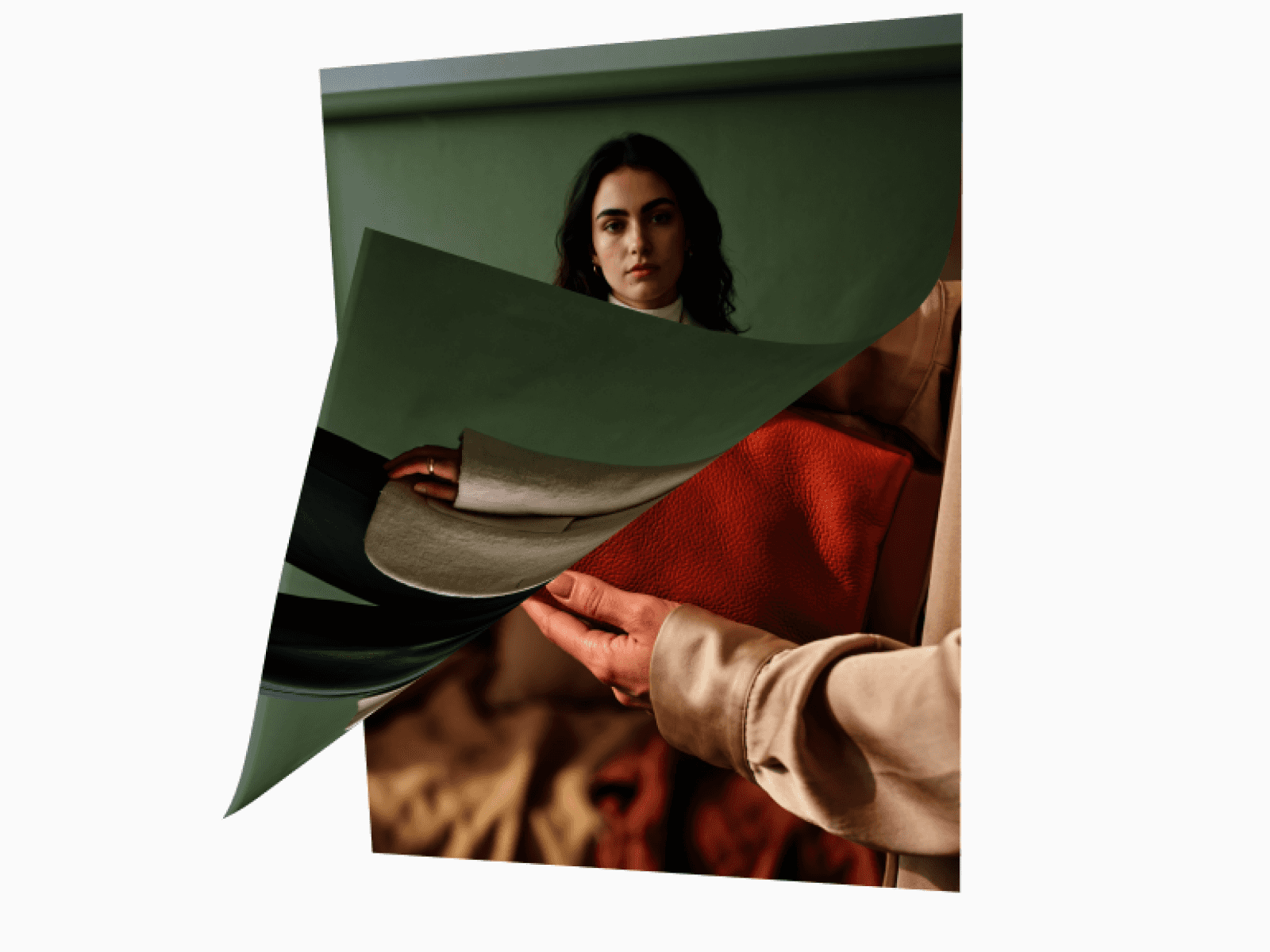
Fashion lookbooks and editorial decks
Film, photography, and video hero reels
SaaS feature spotlights
Interactive product feature carousels
Digital collectible and artwork displays