About Info Tooltip
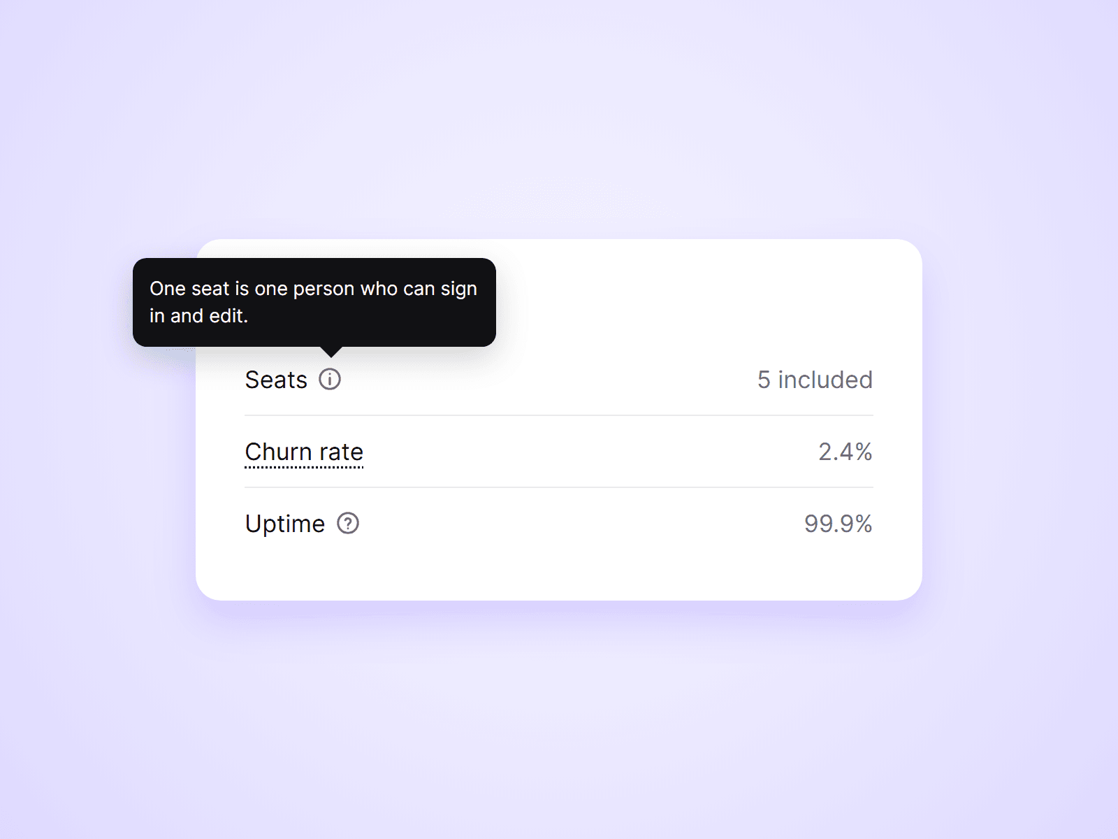
A small tooltip for explaining things in place. Put an info icon next to a label, or underline a word, and a short explanation appears when visitors hover, tap or focus it. Good for pricing tables, feature lists, forms and any term that needs one more sentence.
What you can customize
Everything is set from the property panel. No code needed.
- Type: an icon, or a word with a dotted underline
- Icon: info or question mark, size and color
- Word: text, font, color and underline style
- Tooltip text, with an optional title
- Side: top, bottom, left or right
- Gap and hover delay
- Tooltip fill, text color, radius, padding and max width
- Arrow and shadow, shown or hidden
- Tooltip font
Details
- Opens on hover, on tap and on keyboard focus. Escape closes it.
- If there is no room on the side you chose, it opens on the opposite side.
- Near the edge of the window it slides inward, and the arrow still points at the icon.
- It is drawn above the whole page, so a parent layer with clipped overflow cannot cut it off.
- On touch screens a tap opens it and a second tap, or a tap elsewhere, closes it.
- Screen readers read the tooltip together with the icon or word.
- Press Enter in the Text field to start a new line.
How to use
Add the component next to a label and type your explanation into Text. It is as small as its icon or word, so it fits inside stacks and text rows. To style the tooltip, set On Canvas to Open and it stays visible on the canvas. Set it back to Closed when you are done. On the canvas the tooltip does not react to the pointer. Open the preview to try it.
Code
This is a code component. Unlinking is not available, so the source cannot be viewed or edited. Updates arrive through the Update button in your Assets panel.
Support
Email joviseo1106@gmail.com. Replies usually take up to 3 business days. More components are at https://joviseo.vercel.app