About Work Vision Gallery
About this Component
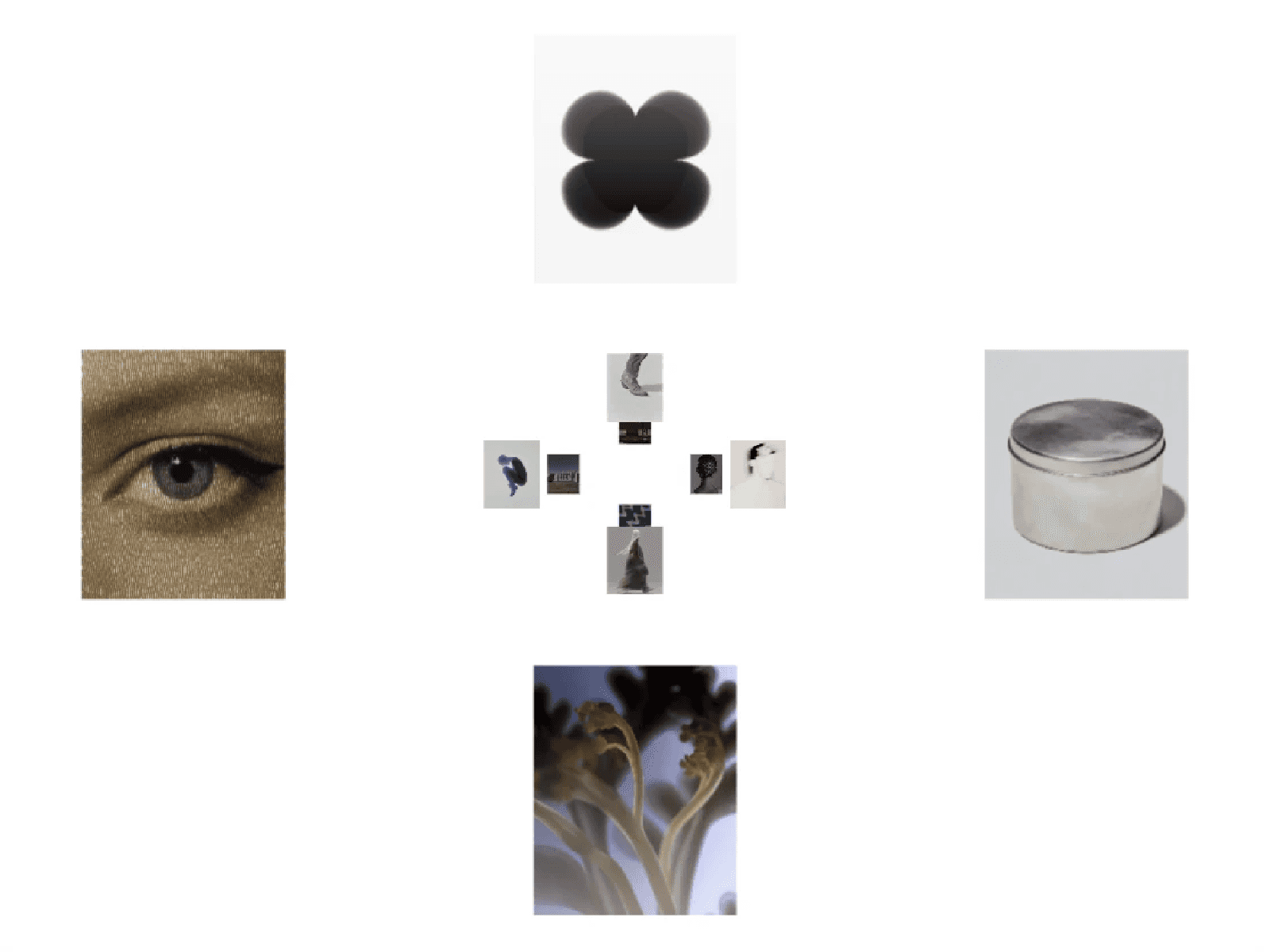
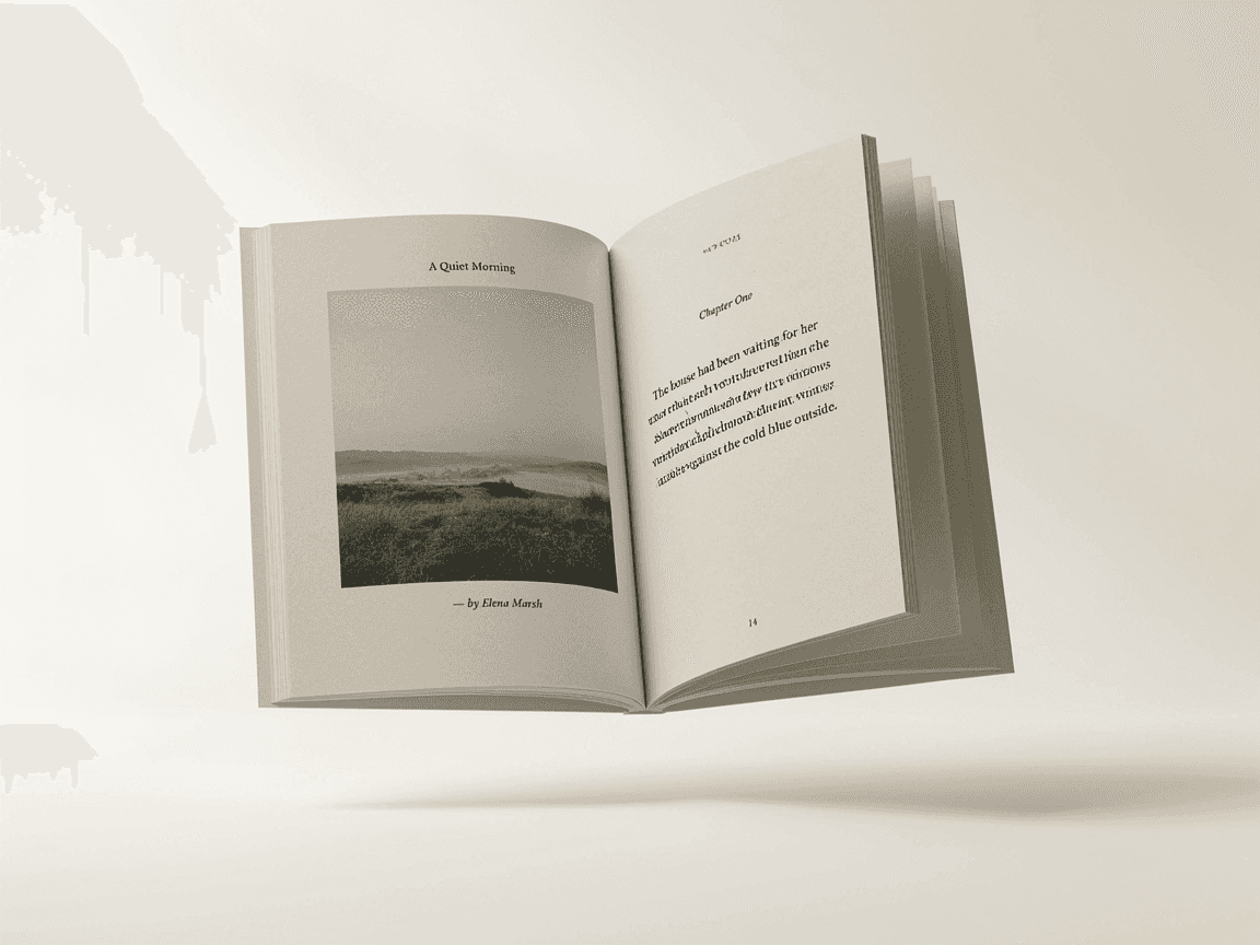
Scroll Grid Gallery is an immersive scroll-driven image gallery built for portfolios, project showcases, photography, and editorial websites.
As you scroll, layered images move through the viewport with depth and parallax before a featured image expands across the screen. The surrounding gallery cards spread outward during the transition, creating a cinematic handoff into the final full-screen image reveal.
Perfect For
Portfolio and case study pages
Photography websites
Creative studios and agencies
Editorial layouts
Project and work showcases
Key Features
Scroll-driven gallery animation
Expanding featured image
Responsive desktop and mobile layouts
Smooth mouse parallax on desktop
Smooth image hover interaction
Upload up to 19 gallery images
Separate featured image control
Adjustable scroll distance and smoothing
Custom expansion timing, height, and grid spread
Full typography control including size, weight, line height, and letter spacing
Custom background, title color, shadow, and breakpoint
Canvas preview progress control
Reduced-motion support
How It Works
Add your gallery images and featured image, then customize the typography, colors, scroll timing, expansion height, grid spread, and interaction settings directly from Framer’s property panel.
The component creates its own scroll distance and uses a sticky viewport stage for the animation. Keep parent Overflow set to Visible for the sticky behavior to work correctly.
Questions?
Reach out at hasanwali6890@gmail.com
Refund Policy
This is a non-tangible digital product. All sales are final.
Refunds are only considered for confirmed critical technical failures that prevent the component’s core functionality and cannot be reasonably resolved through support.
Refunds are not provided for buyer’s remorse, aesthetic preferences, customization requests, or modifications made after purchase.
Any technical issue must be reported within 14 days of purchase with supporting evidence.