Gwen A5h
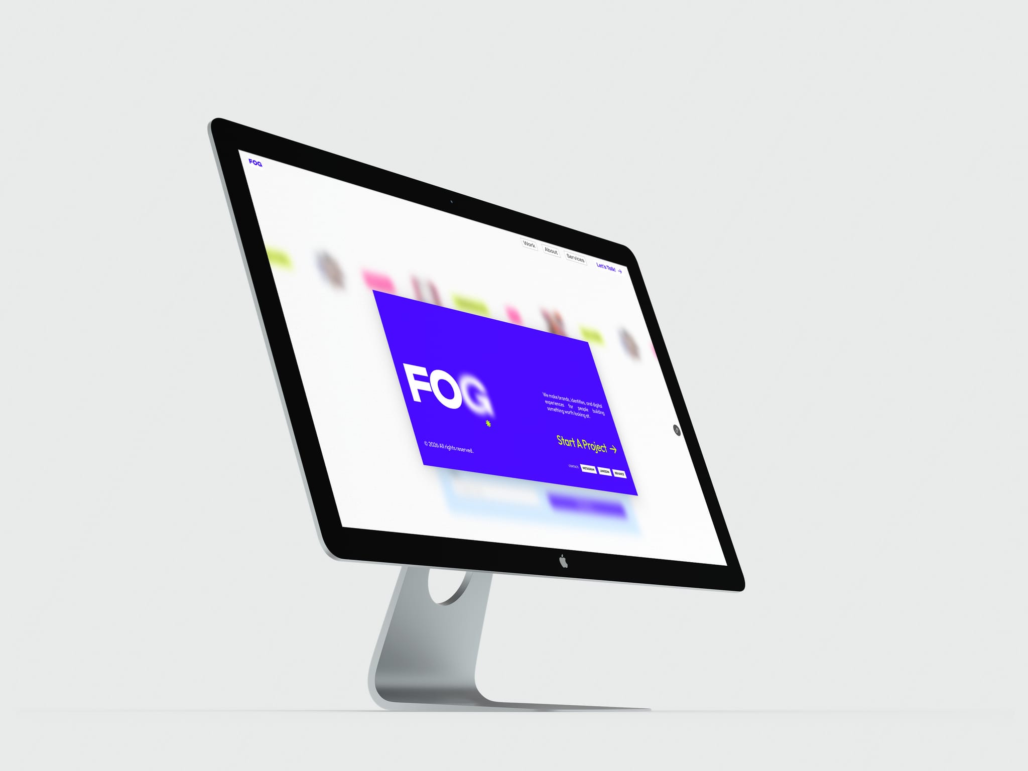
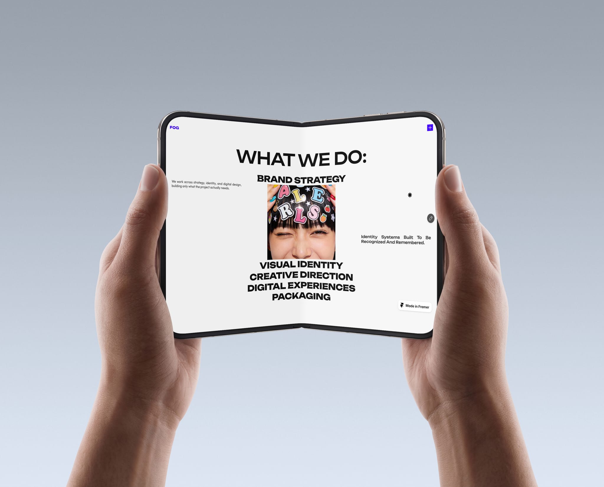
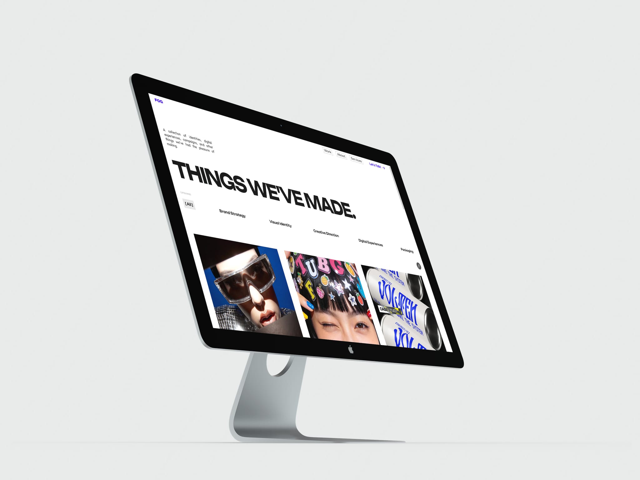
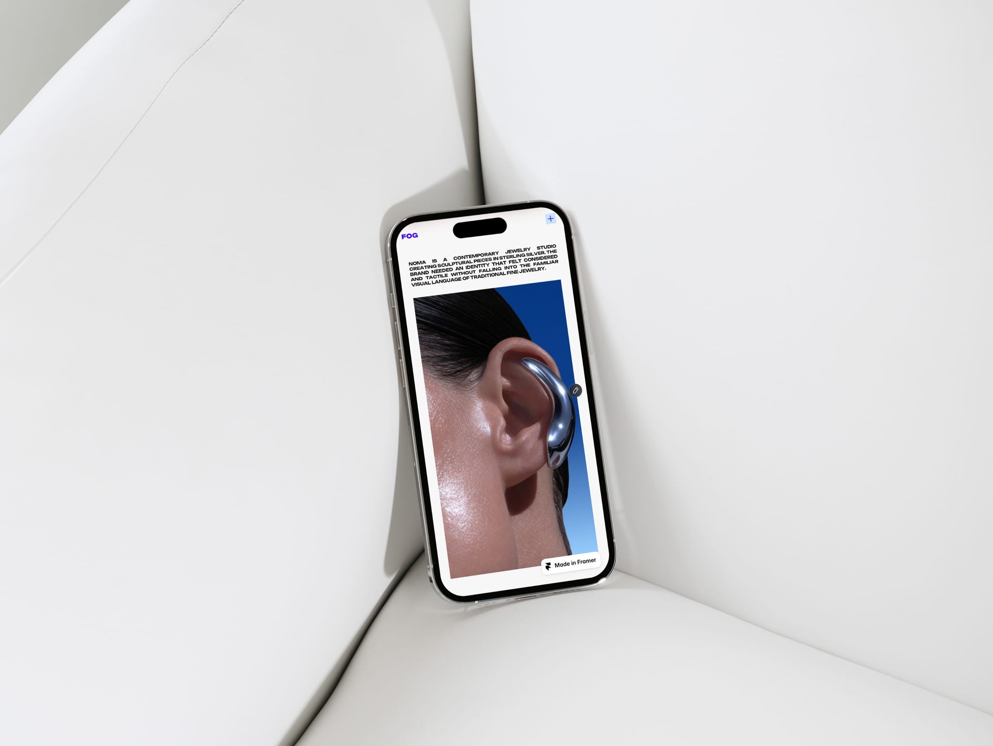
Here's a snippet from FOG, my 2nd Framer Template.
Check it out, remix it, tell me what do you think? it's free 🎸

Here's a snippet from FOG, my 2nd Framer Template.
Check it out, remix it, tell me what do you think? it's free 🎸
I just released Fog, my second Framer template, and it's free. It's built for studios and creatives who want their work to come into focus: soft blur, subtle grain, and a CMS that makes publishing projects easy.
I'd love to hear what you think. 🎸
Some stuff I designed for my next Framer template as visual assets.
Feel free to use, if you like them 😉
Working on a new template, decided to experiment on some illustrated media, here' the result.
Created using Freepik, Unblast and Photoshop, you can use it if you like:
I noticed this hover interaction on Tile's website and decided to try to create something similar in Framer.
Should I post a tutorial?
I'm really proud of the detailing in Votive CMS Journal page, 📃 🔍
How's your Monday going?
Working on a new component that imitates Photoshop's Magic Wand tool.
What do you think?
Working on a new component that imitates Photoshop's Magic Wand tool.
What do you think?
Just released Magic Wand Reveal — a Photoshop-inspired image interaction for Framer.
Hover or click any color in an image to isolate it instantly, reveal a transparency checkerboard, and animate the classic marching-ants selection.
• Hover or click trigger
• Adjustable color tolerance
• Contiguous or global color selection
• Isolate and erase modes
• Fully customizable checkerboard and selection styling
Built for portfolios, editorial sites, product pages, and experimental landing pages.
Try it live → https://magic-wand-select.framer.website/
What if the "ugliest color in the world" made a better hero section than anything trending right now?
Pantone 448C — used on cigarette packs to make people buy less. I built this instead.
Hey guys, how's your Monday going?!
Look at this snippet from my template 👀
A 404 can be creative too, especially if it's for online fashion boutique.
What if the "ugliest color in the world" made a better hero section than anything trending right now?
Pantone 448C — used on cigarette packs to make people buy less. I built this instead.
Let's talk...
QUESTION to fellow designers:
Do you think there are conceptually ugly colors for UI?
if yes, what EXACT color you think can ruin whole visuals?
One interaction I really enjoyed building for Votive.
Every colour swatch is connected to the CMS, so selecting a new variant instantly updates the product images—no manual setup on individual pages.
Small detail, smoother experience.
I think this is the most editorial-looking section in my Votive template.
Hope you like it as much as I do. ✨
Ending the week with a little navigation interaction from Votive.
Have a great Sunday, and here's to a fresh start next week. ✨
Just sharing a footer from my Framer ecommerce template, Votive.
Hope you are enjoying your weekend! 🎸
I built ecommerce website that helps you understand WHAT you're buying.
It's free for now: https://l1nq.com/as6dpov
Built this sticky-scroll section for Votive's Impact page: walking through their sourcing standards. The card pins in place while copy and imagery scroll through each one, almost like flipping through a lookbook.
Kept the palette warm and paper-like, with a little scissor/stitched-edge treatment on the images for texture — felt right for a brand talking about materials and craftsmanship.
Curious how you'd handle the scroll pacing, or whether you'd add a progress indicator for the four steps 🙏
Here's a snippet from FOG, my 2nd Framer Template.
Check it out, remix it, tell me what do you think? it's free 🎸
I just released Fog, my second Framer template, and it's free. It's built for studios and creatives who want their work to come into focus: soft blur, subtle grain, and a CMS that makes publishing projects easy.
I'd love to hear what you think. 🎸
Some stuff I designed for my next Framer template as visual assets.
Feel free to use, if you like them 😉
Working on a new template, decided to experiment on some illustrated media, here' the result.
Created using Freepik, Unblast and Photoshop, you can use it if you like:
I noticed this hover interaction on Tile's website and decided to try to create something similar in Framer.
Should I post a tutorial?
I'm really proud of the detailing in Votive CMS Journal page, 📃 🔍
How's your Monday going?
Working on a new component that imitates Photoshop's Magic Wand tool.
What do you think?
Working on a new component that imitates Photoshop's Magic Wand tool.
What do you think?
Just released Magic Wand Reveal — a Photoshop-inspired image interaction for Framer.
Hover or click any color in an image to isolate it instantly, reveal a transparency checkerboard, and animate the classic marching-ants selection.
• Hover or click trigger
• Adjustable color tolerance
• Contiguous or global color selection
• Isolate and erase modes
• Fully customizable checkerboard and selection styling
Built for portfolios, editorial sites, product pages, and experimental landing pages.
Try it live → https://magic-wand-select.framer.website/
What if the "ugliest color in the world" made a better hero section than anything trending right now?
Pantone 448C — used on cigarette packs to make people buy less. I built this instead.
Hey guys, how's your Monday going?!
Look at this snippet from my template 👀
A 404 can be creative too, especially if it's for online fashion boutique.
What if the "ugliest color in the world" made a better hero section than anything trending right now?
Pantone 448C — used on cigarette packs to make people buy less. I built this instead.
Let's talk...
QUESTION to fellow designers:
Do you think there are conceptually ugly colors for UI?
if yes, what EXACT color you think can ruin whole visuals?
One interaction I really enjoyed building for Votive.
Every colour swatch is connected to the CMS, so selecting a new variant instantly updates the product images—no manual setup on individual pages.
Small detail, smoother experience.
I think this is the most editorial-looking section in my Votive template.
Hope you like it as much as I do. ✨
Ending the week with a little navigation interaction from Votive.
Have a great Sunday, and here's to a fresh start next week. ✨
Just sharing a footer from my Framer ecommerce template, Votive.
Hope you are enjoying your weekend! 🎸
I built ecommerce website that helps you understand WHAT you're buying.
It's free for now: https://l1nq.com/as6dpov
Built this sticky-scroll section for Votive's Impact page: walking through their sourcing standards. The card pins in place while copy and imagery scroll through each one, almost like flipping through a lookbook.
Kept the palette warm and paper-like, with a little scissor/stitched-edge treatment on the images for texture — felt right for a brand talking about materials and craftsmanship.
Curious how you'd handle the scroll pacing, or whether you'd add a progress indicator for the four steps 🙏
Here's a snippet from FOG, my 2nd Framer Template.
Check it out, remix it, tell me what do you think? it's free 🎸
I just released Fog, my second Framer template, and it's free. It's built for studios and creatives who want their work to come into focus: soft blur, subtle grain, and a CMS that makes publishing projects easy.
I'd love to hear what you think. 🎸
Some stuff I designed for my next Framer template as visual assets.
Feel free to use, if you like them 😉
Working on a new template, decided to experiment on some illustrated media, here' the result.
Created using Freepik, Unblast and Photoshop, you can use it if you like:
I noticed this hover interaction on Tile's website and decided to try to create something similar in Framer.
Should I post a tutorial?
I'm really proud of the detailing in Votive CMS Journal page, 📃 🔍
How's your Monday going?
Working on a new component that imitates Photoshop's Magic Wand tool.
What do you think?
Working on a new component that imitates Photoshop's Magic Wand tool.
What do you think?
Just released Magic Wand Reveal — a Photoshop-inspired image interaction for Framer.
Hover or click any color in an image to isolate it instantly, reveal a transparency checkerboard, and animate the classic marching-ants selection.
• Hover or click trigger
• Adjustable color tolerance
• Contiguous or global color selection
• Isolate and erase modes
• Fully customizable checkerboard and selection styling
Built for portfolios, editorial sites, product pages, and experimental landing pages.
Try it live → https://magic-wand-select.framer.website/
What if the "ugliest color in the world" made a better hero section than anything trending right now?
Pantone 448C — used on cigarette packs to make people buy less. I built this instead.
Hey guys, how's your Monday going?!
Look at this snippet from my template 👀
A 404 can be creative too, especially if it's for online fashion boutique.
What if the "ugliest color in the world" made a better hero section than anything trending right now?
Pantone 448C — used on cigarette packs to make people buy less. I built this instead.
Let's talk...
QUESTION to fellow designers:
Do you think there are conceptually ugly colors for UI?
if yes, what EXACT color you think can ruin whole visuals?
One interaction I really enjoyed building for Votive.
Every colour swatch is connected to the CMS, so selecting a new variant instantly updates the product images—no manual setup on individual pages.
Small detail, smoother experience.
I think this is the most editorial-looking section in my Votive template.
Hope you like it as much as I do. ✨
Ending the week with a little navigation interaction from Votive.
Have a great Sunday, and here's to a fresh start next week. ✨
Just sharing a footer from my Framer ecommerce template, Votive.
Hope you are enjoying your weekend! 🎸
I built ecommerce website that helps you understand WHAT you're buying.
It's free for now: https://l1nq.com/as6dpov
Built this sticky-scroll section for Votive's Impact page: walking through their sourcing standards. The card pins in place while copy and imagery scroll through each one, almost like flipping through a lookbook.
Kept the palette warm and paper-like, with a little scissor/stitched-edge treatment on the images for texture — felt right for a brand talking about materials and craftsmanship.
Curious how you'd handle the scroll pacing, or whether you'd add a progress indicator for the four steps 🙏