About Synced Carousel
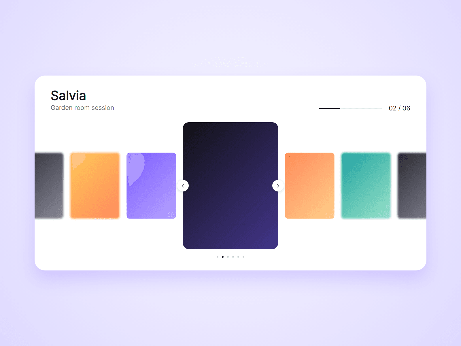
A centered image carousel. One slide is large in the middle and the others are smaller on both sides. Text and a progress bar placed anywhere on the page follow the slide in the middle.
What you can customize
Everything is set from the property panel. No code needed.
- Slides: image, title, caption and link, up to 24
- Slide width, ratio (3:4, 4:5, 1:1, 4:3, 16:9), gap and radius
- Side slides: scale, opacity, blur and grayscale
- Built-in caption: shown or hidden, left or centered, fonts and colors
- Arrows and dots: shown or hidden, size and colors
- Loop, drag, autoplay, start slide and transition
- Linked Text: title, caption or counter, with its own font and color
- Linked Progress: colors, thickness and radius
Details
- Set Type to Text or Progress and use the carousel's Group name. That layer then shows the active slide's title, caption, number (02 / 06) or progress, anywhere on the page.
- Visitors can use arrows, dots, drag, swipe, a sideways trackpad swipe, or the arrow keys.
- Clicking a side slide brings it to the middle. Clicking the middle slide opens its link. A drag never opens a link.
- Autoplay pauses on hover, while dragging and off screen.
- The middle slide shrinks to fit phone screens.
- Works with screen readers.
- Slides are typed in by you. It does not load slides from a CMS collection.
How to use
Add the component to your page and set its width to Fill. Open Slides and add your images, titles and links. For linked text, paste another copy, set Type to Text and choose what it shows. On the canvas the carousel does not move. Open the preview to try it.
Code
This is a code component. Unlinking is not available, so the source cannot be viewed or edited. Updates arrive through the Update button in your Assets panel.
Support
Email joviseo1106@gmail.com. Replies usually take up to 3 business days. More components are at https://joviseo.vercel.app