About Animated Chart
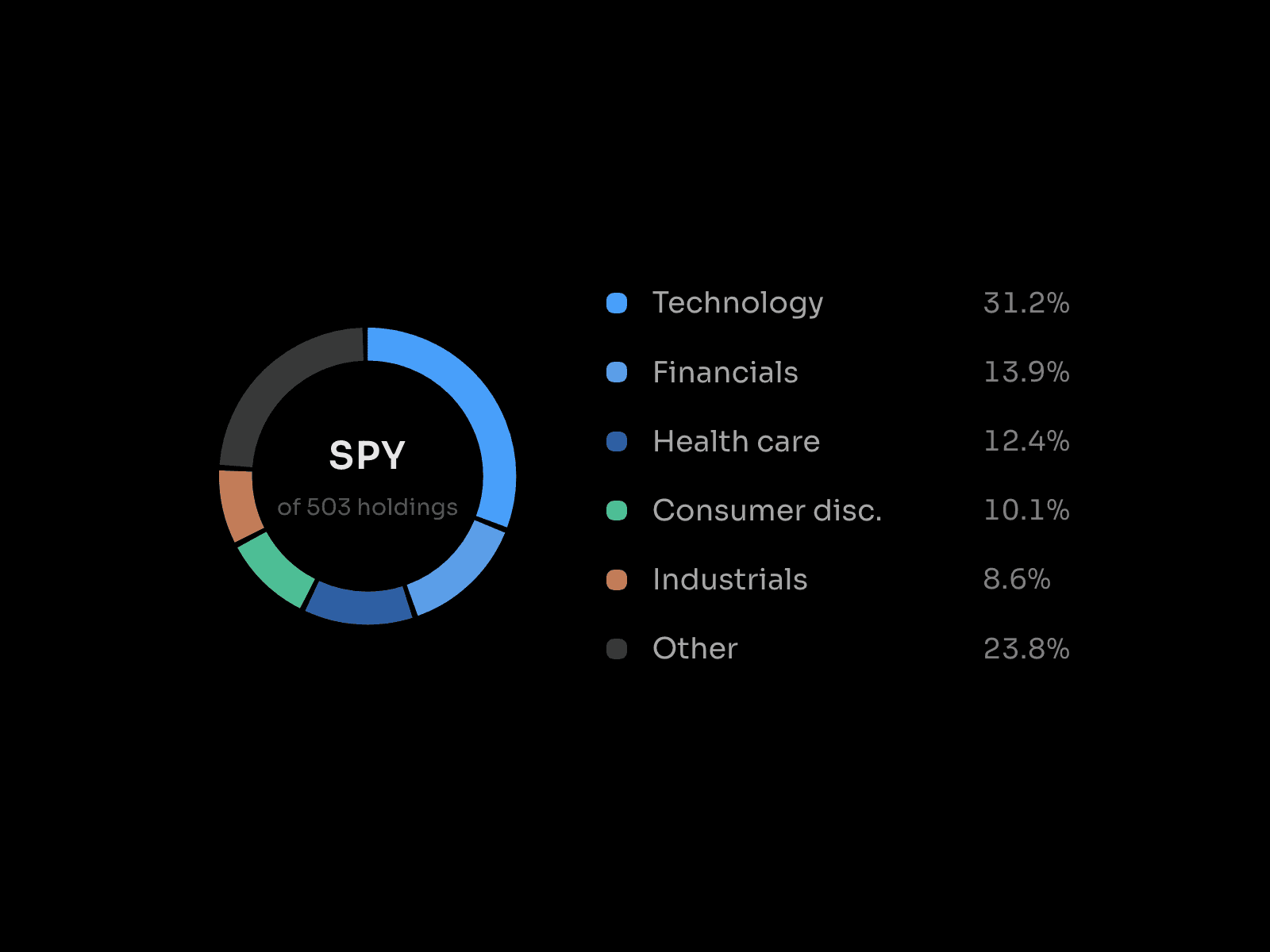
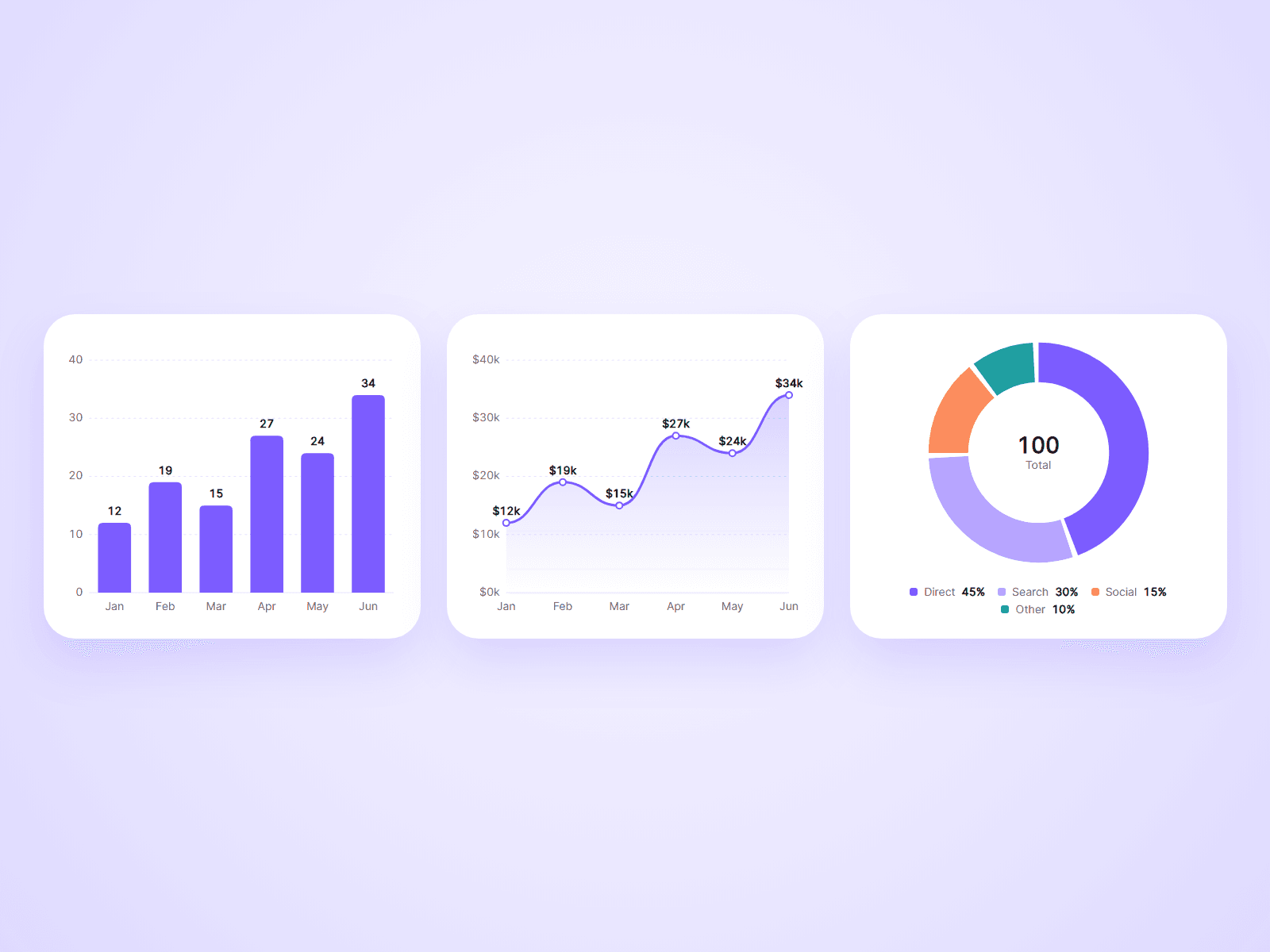
Bar, line and donut charts in one component. Type your labels and numbers into the property panel and the chart draws itself when the visitor scrolls to it.
What you can customize
Everything is set from the property panel. No code needed.
- Type: Bar, Line or Donut
- Up to 24 data points, each with a label and a value
- Colors, used in order
- Number prefix, suffix and decimals, such as $ or %
- Values above bars and points, and a tooltip on hover
- Axis labels, scale and grid lines
- Bar gap, corner radius, and one color or a color per bar
- Line shape, area fill, dots and width
- Donut thickness up to a full pie, center total, and legend on the right or bottom
- Animation duration and stagger
- Font and colors for labels and values
Details
- The chart is drawn at its real size, so text stays sharp and keeps its size when you resize the component.
- The scale picks round numbers by itself and starts at zero.
- Bars grow from the baseline, the line draws from left to right, and the donut sweeps around.
- Hovering a donut slice shows that slice in the center.
- Works with screen readers through a text summary of the data. Visitors with reduced motion turned on see the finished chart.
- Data is typed in by you. The chart does not load from a CMS or an outside service.
How to use
Add the component to your page and resize it. Choose a Type, then open Data and type your labels and values. On the canvas the chart is shown finished so you can style it. Open the preview to see it draw.
Code
This is a code component. Unlinking is not available, so the source cannot be viewed or edited. Updates arrive through the Update button in your Assets panel.
Support
Email joviseo1106@gmail.com. Replies usually take up to 3 business days. More components, including four free ones, are at https://joviseo.vercel.app