About Live Pricing Table
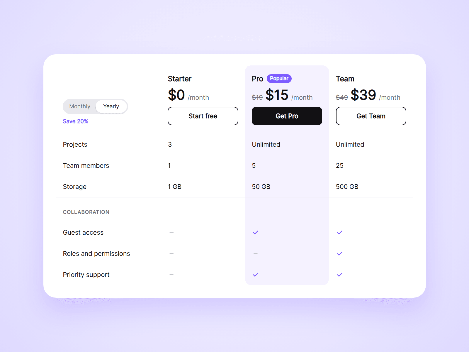
A plan comparison table with a Monthly / Yearly toggle built in. Visitors compare your plans feature by feature, and one click switches every price in the table. On narrow screens it becomes cards that show one plan at a time.
What you can customize
Everything is set from the property panel. No code needed.
- Plans, up to 5: name, monthly and yearly price, suffix, button and link
- Highlight for one plan, with a badge such as Popular
- Rows, up to 60: one line each, such as yes | no | 10 GB
- Toggle: labels, a note such as Save 20%, or hidden
- Old price crossed out next to the yearly price
- Colors of text, lines, check marks, highlight and header
- Buttons: colors, radius, outline or filled
- Fonts for names, prices and text
- Padding, radius and the width where it becomes cards
- Sticky header
Details
- Type yes or no in a row to get a check mark or a dash. Anything else shows as text.
- A row with no values becomes a heading, so you can group features.
- The table measures its own width, not the browser window. In a narrow column on a wide screen it still becomes cards.
- In card view visitors choose a plan with tabs. The highlighted plan is shown first.
- Use the same Group name as Live Pricing Toggle or Live Pricing Slider and one click changes them all.
- It changes the prices shown on the page. It does not change checkout links.
How to use
Add the component to your page and set its width to Fill. Open Plans and Rows and type your content. To see the cards on the canvas, set Layout to Cards. On the canvas the toggle cannot be clicked. Open the preview to try it.
Code
This is a code component. Unlinking is not available, so the source cannot be viewed or edited. Updates arrive through the Update button in your Assets panel.
Support
Email joviseo1106@gmail.com. Replies usually take up to 3 business days. More components are at https://joviseo.vercel.app