About Plan Matrix
Pricing cards and a plan comparison table in one section. Monthly/yearly toggle, feature tooltips, a sticky first column, and plan cards on mobile. No CMS.
WHAT IT IS
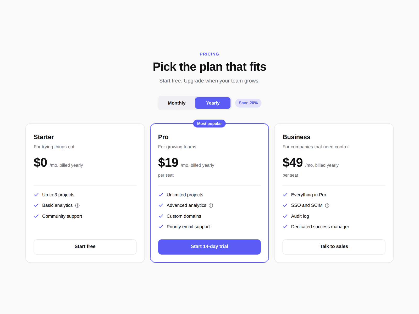
Two parts you can show together or on their own. On top, up to four plan cards with a monthly/yearly switch and a highlighted plan. Below, a comparison table that keeps feature names pinned while visitors scroll sideways, and turns into one card per plan when the section gets narrow.
WHAT YOU GET
— Monthly/yearly toggle with your own labels, a "Save 20%" chip and a default choice, or one price only
— Prices as plain text, so "$19", "€15" or "Contact sales" all work, plus an optional crossed-out price and a note under it
— A highlighted plan with an accent edge and a "Most popular" badge. Card heights match so buttons line up
— Feature lists on every card, with an info tooltip on any line (hover, tap or keyboard)
— Table rows as lines of text: "# Group" starts a section, "Feature | Starter | Pro | Business" adds a row
— yes, no and limited become a check, a cross and a Limited pill, with screen-reader text. Anything else shows as written
— A placeholder of your choice for blank cells, a sticky first column, and a highlighted featured column
— Below a width you set, the table becomes one card per plan (it follows the section's width, so it works in narrow columns too)
— Cards only, table only, or both. Light and dark themes, accent color, max width, anchor ID, footnote
WHAT IT DOES NOT DO
No checkout inside: every button is a plain link to your own signup or payment page, and nothing is collected or sent. Rows come from the properties panel, not a CMS collection.
BUILT FOR
SaaS sites, apps, agencies and course creators.
Zero external libraries, zero layout shift: switching monthly and yearly changes the prices, never the card sizes. Every plan and row is real text for search engines and screen readers.
Everything is set from the properties panel. No code.