

About Bunny Ellerin
Most of the brief was what to keep
Bunny Ellerin already had the words and the page flow she wanted. An earlier redesign had drifted away from both, so this round was deliberately narrow: keep her copy and navigation exactly as written, and change only the interface.
What changed
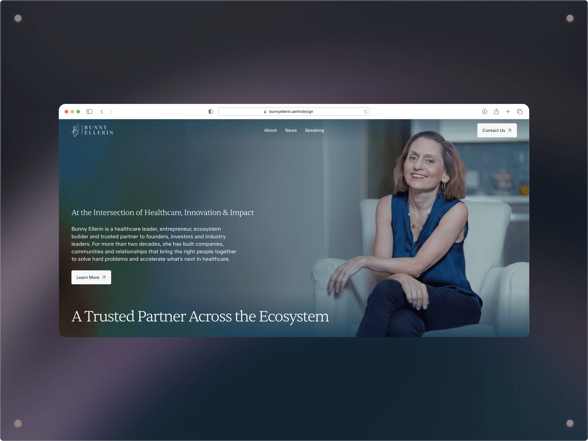
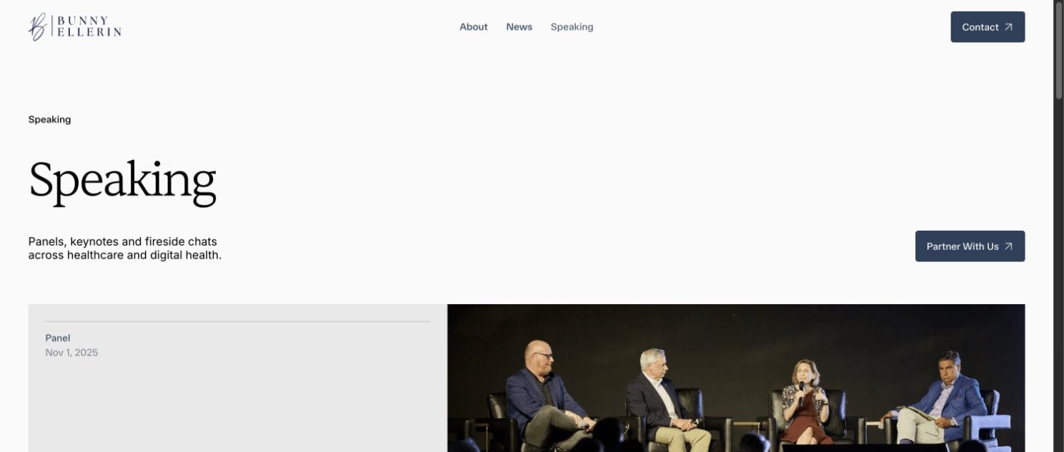
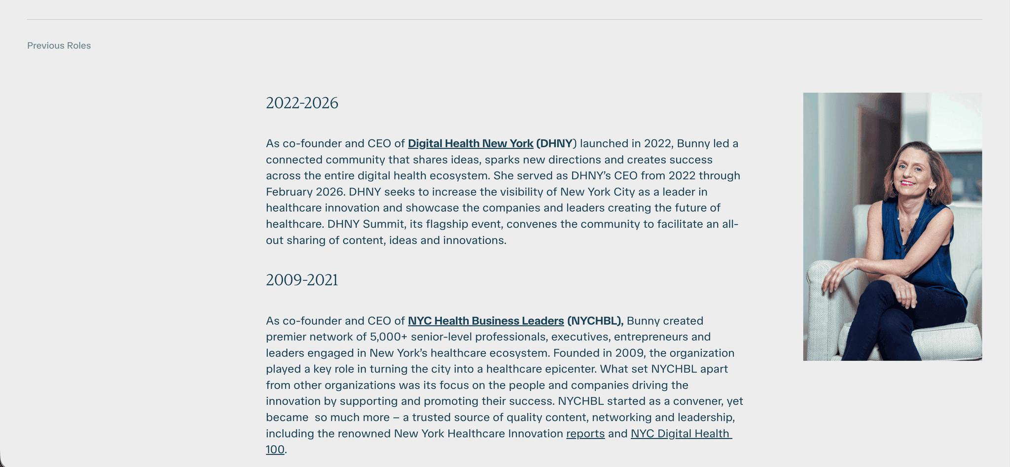
A light grey ground, with her blue and teal carried through the components
A refined version of her B-in-circle logomark
Her preferred hero imagery, optimised for the web
We then moved the finished design into Framer, where Bunny now edits her own content. Anyone who knew the old site will find the same pages in the same order, in an interface that no longer looks dated.